

Why use FlexBox
Flexbox is a layout model that allows elements to align and distribute space within a container. Using flexible widths and heights, elements can be aligned to fill a space or distribute space between elements, which makes it a great tool to use for responsive design systems.
Flex Box is much easier than CSS Grid
In your CSS journey most of the time you are going to use display: flex, align-items, and justify-content
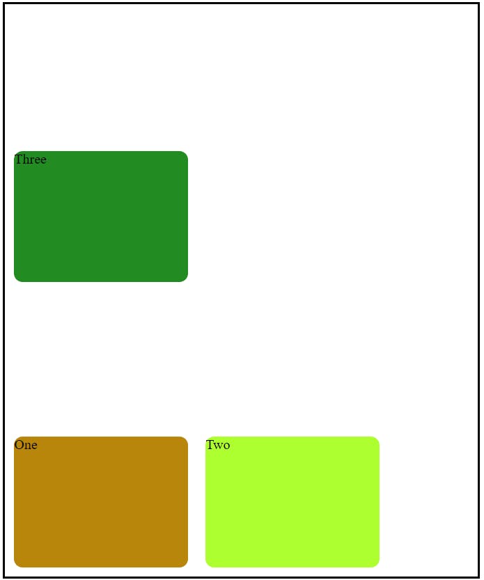
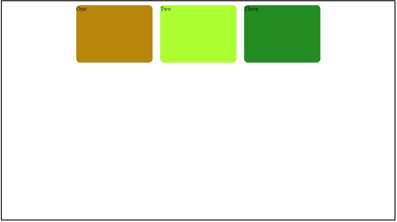
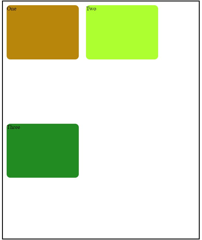
first, assume we have a basic HTML page. under body we have 3 elements, like this
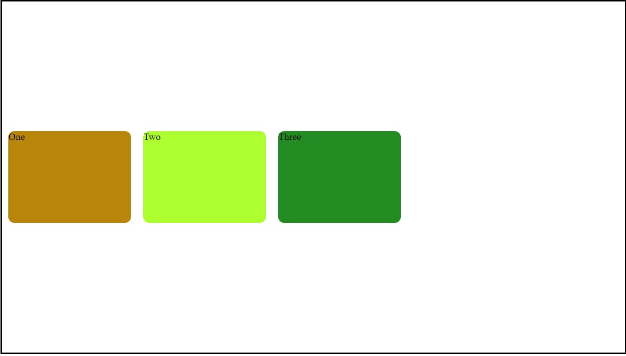
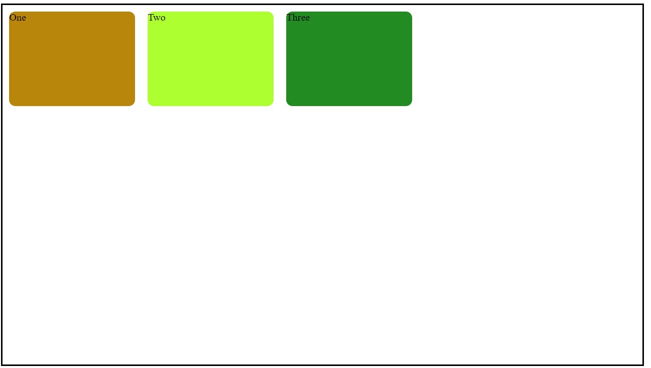
1) display: flex
to use flex property we have to give display: flex to the parent element. flex by default use flex-direction: row; means the direction of the elements will be row
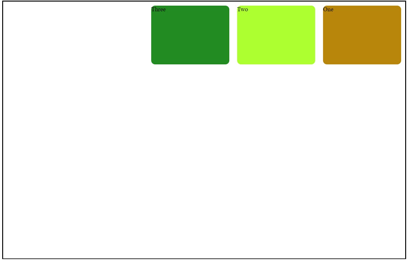
After using display:flex to the body the HTML page will look like this

2) align-items
This property helps to take the elements top, bottom, and center vertically
align-items: center => take all elements vertically center
align-items: flex-end => take elements at the end or bottom
align-items: flex-start => take elements at the top

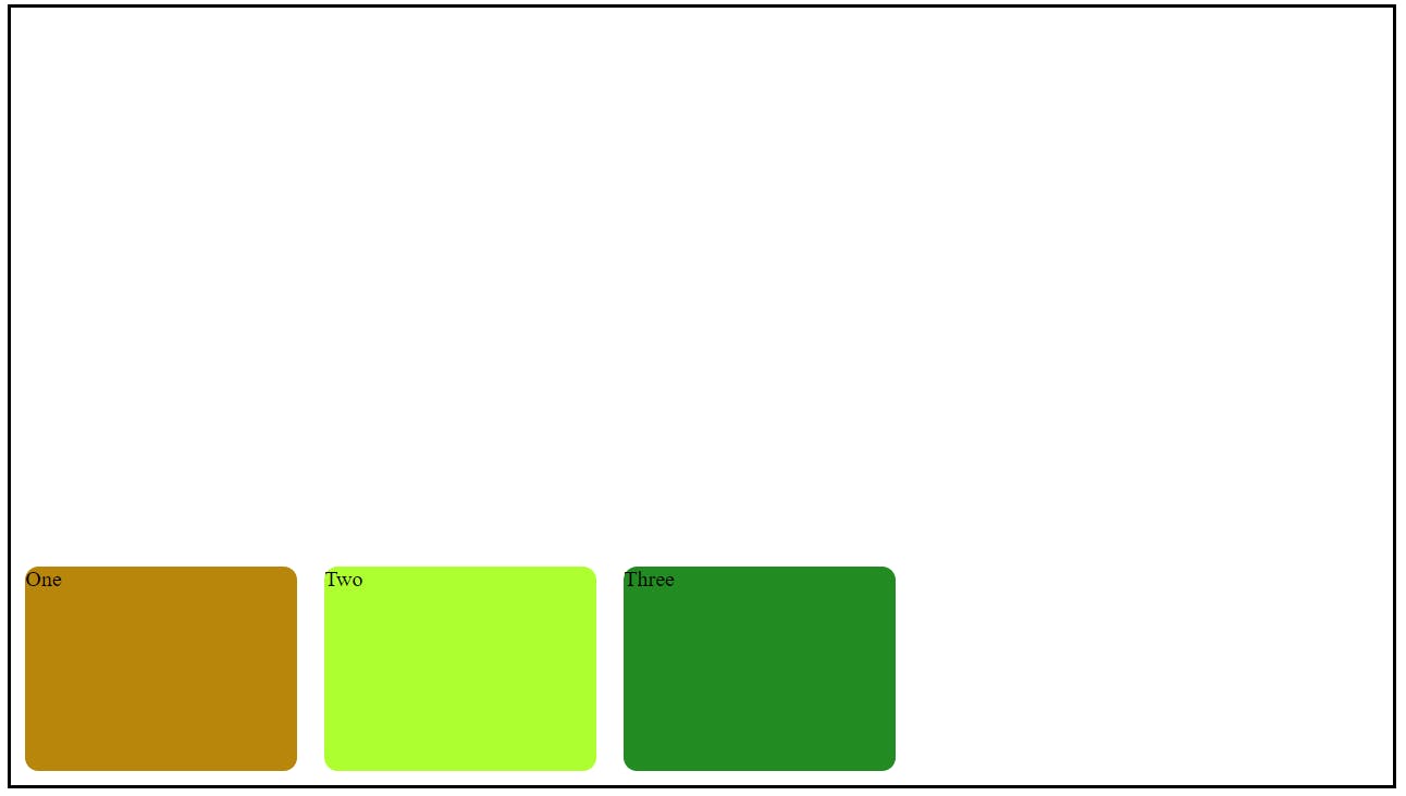
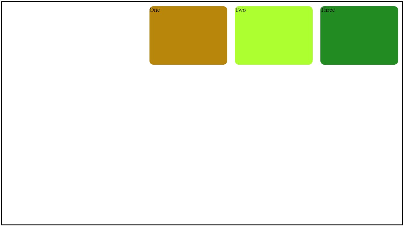
3) justify-content
this property moves the elements horizontally
justify-content: center => it horizontally centers all elements, like this below example
justify-content: flex-start => it takes all elements to start of the container
justify-content: flex-end => it takes all elements to the end of the container
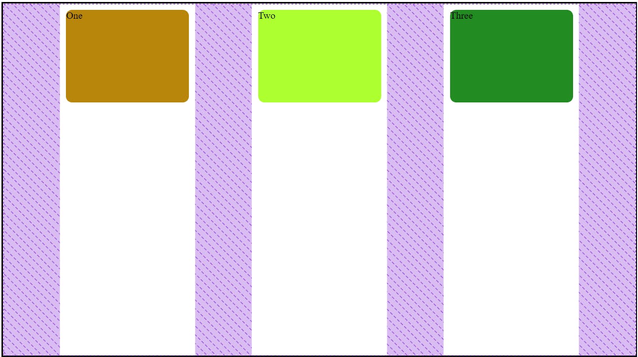
justify-content: space-around => this property gives space, around the elements
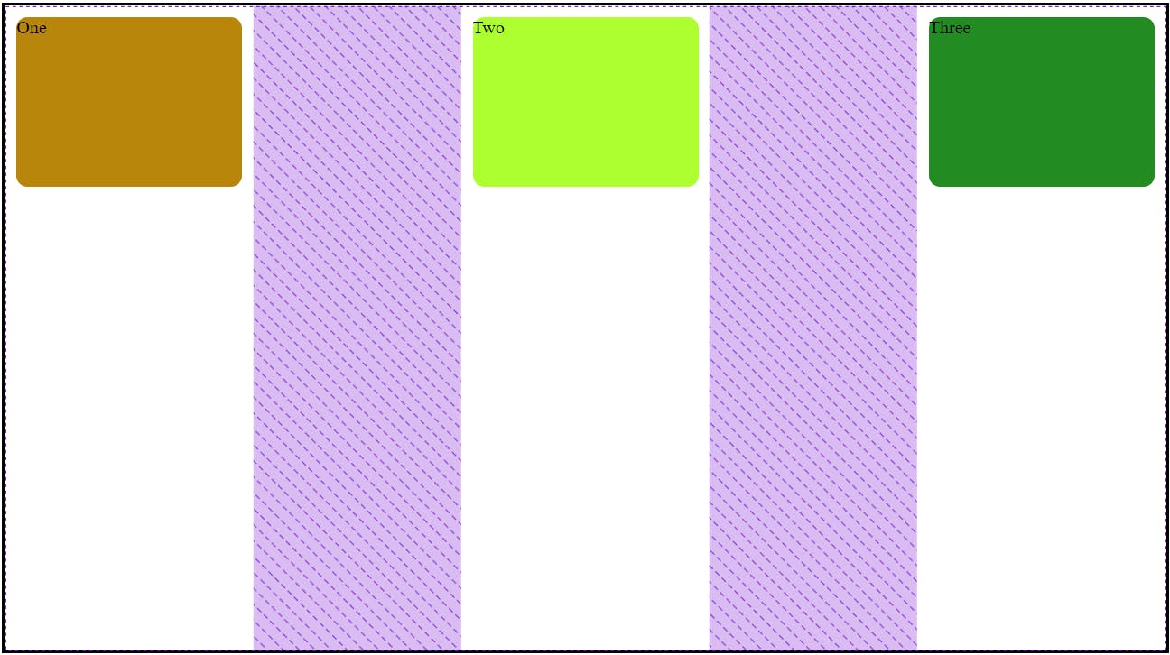
justify-content: space-between => it gives space between elements
justify-content: space-evenly => it distributes space between the elements evenly
4) flex-direction
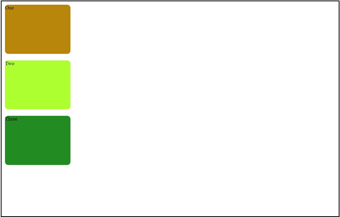
flex-direction: column => this property takes all elements row to column
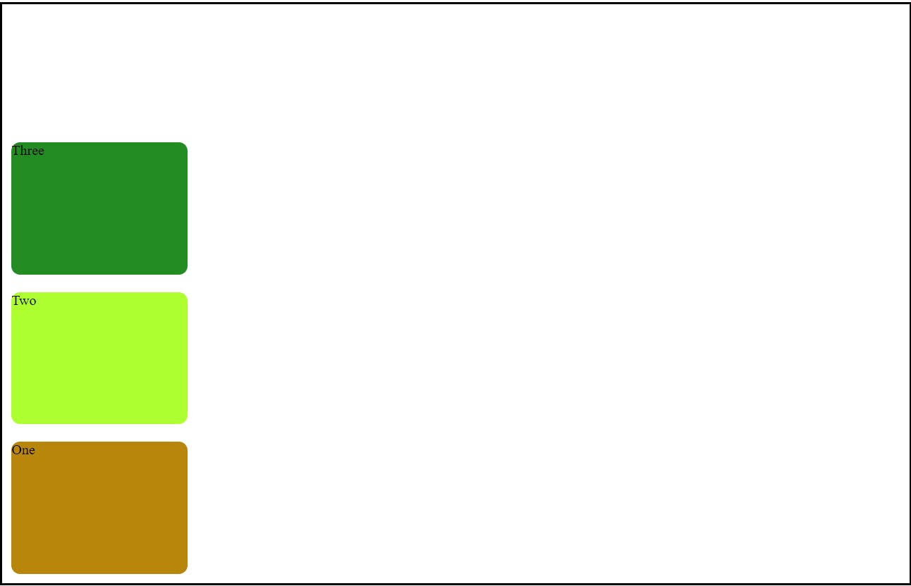
flex-direction: column-reverse => this property takes all elements row to the column but in reverse order
flex-direction: row => this property takes all elements column to row order

flex-direction: row-reverse => this property takes all elements column to row but in reverse order
5) flex-wrap
This flex-wrap property is used to make a website responsive. when a container shrinks then we can automatically adjust the elements under that
flex-wrap: nowrap => this property does nothing.
flex-wrap: wrap => this property plays the main game. it adjusts all elements within the container while the container is shrinking
flex-wrap: wrap-reverse => it does the same thing in reverse order