

Table of contents
CSS Grid
CSS Grid is a two-dimensional layout system that allows web designers to create grid-based layouts with rows and columns. It is a powerful tool for creating flexible and responsive layouts on the web, and provides a more intuitive and efficient way to control layout compared to traditional methods.
How to use CSS Grid
In this article, we will take a look at how to use CSS Grid with code examples. We will start by defining a grid container element and specifying the number of rows and columns in the grid. Then, we will learn how to place elements on the grid and control their behavior when the size of the grid or the elements changes.
To start using CSS Grid, you first need to define a grid container element. This can be any HTML element that you want to use as a container for your grid. For example, you could use a div element like this:
<div class="grid-container">
  <!-- Your grid elements go here -->
</div>
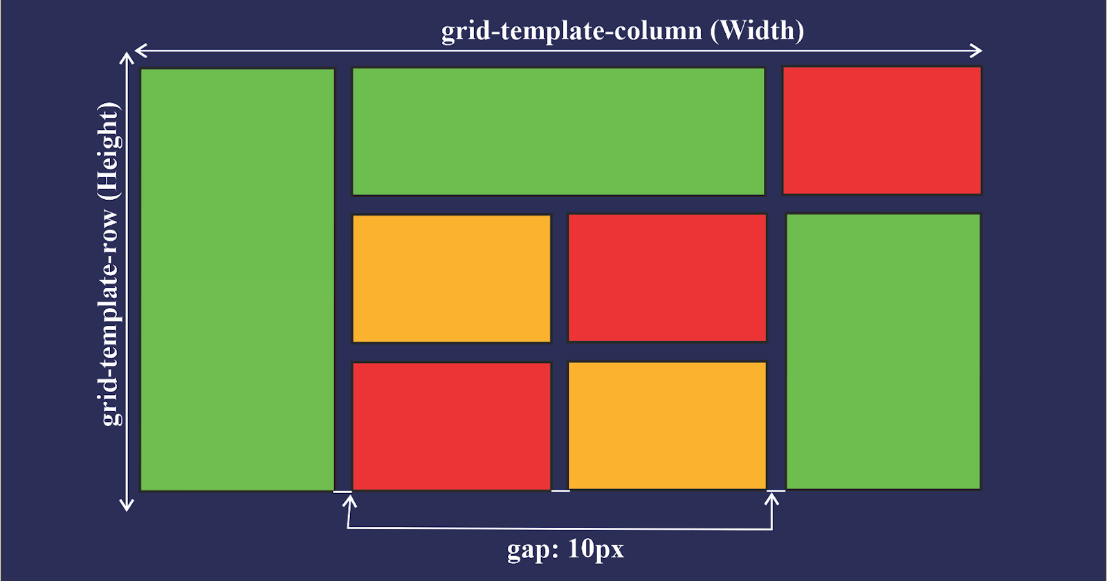
Next, you can specify the number of rows and columns in the grid using the grid-template-rows and grid-template-columns properties. These properties take a list of values that define the size of each row and column in the grid. You can specify the size of each row or column using a variety of units, such as pixels, percentages, or fractions of the available space.
For example, you could create a grid with three equal-sized columns and two equal-sized rows like this:
.grid-container {
  display: grid;
  grid-template-rows: 1fr 1fr;
  grid-template-columns: 1fr 1fr 1fr;
}
You can also use the grid-template-areas property to define a grid using named areas. This can make it easier to visualize and control the layout of your elements. To use this property, you first need to give each element a grid-area value that corresponds to the area you want it to occupy on the grid. Then, you can use the grid-template-areas property to define the layout of the grid using the grid-area values of the elements.
For example, let's say you want to create a grid with a header at the top, a sidebar on the left, and a main content area on the right. You could do this by giving each element a grid-area value and using the grid-template-areas property like this:
<div class="grid-container">
  <header class="header" grid-area="header">Header</header>
  <nav class="sidebar" grid-area="sidebar">Sidebar</nav>
  <main class="main" grid-area="main">Main Content</main>
</div>
.grid-container {
  display: grid;
  grid-template-areas:
    "header header header"
    "sidebar main main";
}

.header {
  grid-area: header;
}

.sidebar {
  grid-area: sidebar;
}

.main {
  grid-area: main;
}
Once you have defined your grid, you can place elements on the grid using the grid-row and grid-column properties. These properties allow you to specify the starting and ending row and column for an element, as well as any spacing between rows and columns.
Thank you for reading ...
I hope this article will help you in your web dev journey 😊😊