Media Queries in CSS

intro
Media queries used to make sites responsive. Media queries allow you to apply CSS styles depending on various devices
Responsive Design: If a website design looks good on all devices ( big monitors, laptops, tablets, and mobiles ) then that kind of design is called responsive design
before Media queries introduce, developers two sites, one for mobile and one for desktop and managed with subdomains. like if someone visits the site on mobile then "sm.sitename.com" will open and if the user opens the site with a computer then "sitename.com" will open
Media Queries change CSS code after a breakpoint. In industry developers mostly use 3 breakpoints
How to use
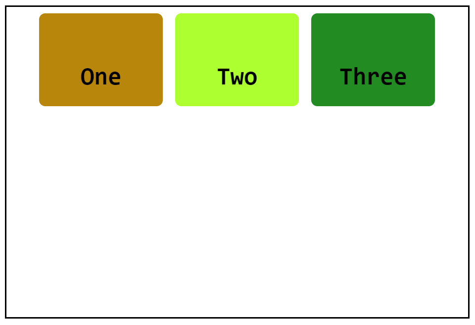
example code
<!DOCTYPE html>
<html lang="en">

<head>
    <meta charset="UTF-8">
    <meta http-equiv="X-UA-Compatible" content="IE=edge">
    <meta name="viewport" content="width=device-width, initial-scale=1.0">
    <title>Document</title>
</head>
<style>
    .one {
        height: 150px;
        width: 200px;
        background: darkgoldenrod;
        border-radius: 10px;
        margin: 10px;
    }

    .two {
        height: 150px;
        width: 200px;
        background: greenyellow;
        border-radius: 10px;
        margin: 10px;
    }

    .three {
        height: 150px;
        width: 200px;
        background: forestgreen;
        border-radius: 10px;
        margin: 10px;
    }

    body{
        margin: 20px;
        border: 3px solid black;
        padding: 0px;
        height: 80vh;
        width: 80vw;
        display: flex;
        justify-content: center;
    }
    h1{
        font-family: monospace;
        font-size: 40px;
        display: flex;
        align-items: center;
        justify-content: center;
        height: 100%;
        width: 100%;
    }
</style>

<body>
    <div class="one">
        <h1>One</h1>
    </div>
    <div class="two">
        <h1>Two</h1>
    </div>
    <div class="three">
        <h1>Three</h1>
    </div>
</body>

</html>
Now I want if the screen size is less then 500px then I want to change background color of the first box to blue. so using media query the code is
@media (max-width: 500px) {
  .one {
        background: blue;
    }
}
So now if I shrink my screen to 500px then the first box color change
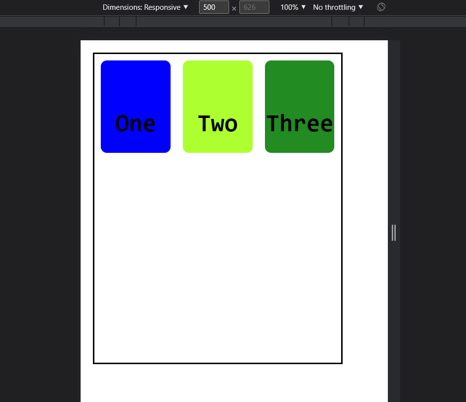
That's how you can change your CSS according to your screen size
Thank you for reading. I hope this will help you in your CSS journey ✌️✌️


